Tuesday, March 29, 2011

Stephen King portrait pt2: Scratchboard


Somewhere along the preparation lines I decided my Stephen King piece might make a nice scratchboard, and thus afford me a good opportunity for self-challenge.  I'm always more comfortable laying black ink on a white surface, but given the light source in the image, it seemed appropriate to 'draw in' the light by scratching white into the black scratchboard surface.

After reworking my photoshop roughs with the blacks filled in, I had a pretty good sense of where I wanted to take it tonally.  It was both a blessing and a curse to have so completely refined the image in the rough stage, because I found myself both challenged to continually improve the final scratchboard, as well as frustrated to have set up certain expectations that were hard to let go of in the rendering stage.

In some ways I find the digital mockup more satisfying, whether due to the spontaneous handling, the smoother edges of the photoshop brushes, or the way I ended up handling the lighting on the body itself.  I'm almost tempted to do a second final drawing, this time drawing in black on claybord.

digital mockup

Sunday, March 27, 2011

Stephen King portrait pt1: thumbnails and roughs


I've always been inspired by creative individuals with a dark slant in their work, and having read Stephen King books from a very early age (perhaps too early?), I thought he might make a good subject for a new portrait.


At first I was thinking well within 'the box', imaging an over the shoulder shot of him working at his typewriter, perhaps with a glimpse of his iconic Dark Tower through his desk window. But in making thumbnails sketches, I quickly realized this approach lacked much dynamism or even any real concept... certainly not capturing the man's dark genius and obsessive, insane prolificacy. Somewhere along the lines early on, I don't remember when exactly, I shifted gears and started working on compositions of Stephen, typewriter gripped overhead, ready to crush his readers (or in my case, the viewer).

 I wanted to challenge myself in a number of ways (perhaps too many at once!). First, I thought it would appear more menacing for him to stare down at the viewer, which required that I work out an upward angle that foreshortens the figure. In my recent sketchbook work, I've been concentrating on better figure construction and breaking the bad habit of firing right into the rendering stage without getting the proportions planned out first. The second challenge would be to support the menacing vantage point by lighting him from below, giving the drawing an eery horror vibe. Both the upward angle and the under lighting were tasks that I lacked much experience with, so the stakes started high.  And all the while I knew that the largest challenge would be recognizably capturing the celebrity's likeness.  After a few google image searches, I had identified what I felt to be Stephen's defining facial characteristics.  Dozens of awkward and mostly unrecognizable characatures then followed.

kind of funny in their own way, but still way off

getting closer...


Finally I had a promising sketch in front of me.  I wasn't feeling the concept of Stephen popping out of a book (see below), but I liked the figure and face enough to based a larger rough drawing on.  I scanned, traced, and reworked the composition digitally with my wacom drawing tablet in photoshop, ultimately reaching a version that I felt confident I could transfer to scratchboard for a successful final rendered drawing.

promising thumbnail, minus book
final rough


To be continued!

Thursday, March 17, 2011

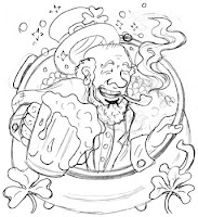
Happy BlogPatrick's Day!

Happy Saint Paddy's Day everyone!

I wanted to include some thumbnails and roughs for the above image, showing how I went through a couple stages of small pencil sketches before scanning, blowing it up, and then inking using a Pentel Pocket Brush pen (a new tool for me!).  This was both a material experiment and a procedural one (as I typically use technical pens, plus I tried inking the image backwards).  Doing it backwards was a test in keeping myself objective about the line quality and composition after staring at the roughs for so long.  I fumbled with the brush pen a bit, but that's all part of the learning process.  Finally, the inked 9x12 drawing was scanned and colored in photoshop.  As always, feel free to click-to-enlarge.

sketchbook tests
super-rough
cleaned up rough
9x12 inked drawing


Sunday, March 6, 2011

drawing lots of drawings!


Sorry for the lull there!  I need to make a better effort to make small posts here on the blog, not just wait until I'm loaded up with things to say (or at least get some twitter posts going to fill in the gaps).

I was sick this week, which kept me firmly planted on the couch with a pencil in hand.  I spent almost the entire weekend in the apartment which isn't typical, and left me feeling a little nutty, but which I felt was necessary to kick my cold... especially in preparation for traveling with my sister to Arizona this week!  I can't wait to see the landscapes, and hopefully find a few minutes to sketch the crazy rock formations!

So while I was holed up this weekend, I spent quite a bit of time working on the non-flash version of my website .  It's almost there, and once I launch it I'll be really excited to check it out on a friend's iPad!  They say flash is terrible for portfolio sites if you're really trying to attract new work, so the redesign has been a necessary evil.  But fortunately I'm learning a lot in the process.  I still have no idea what I'm doing, code-wise, but I'm learning how to lay out a website in Illustrator and Photoshop, which I think will be really good for me in the future.  (I'm also rediscovering my love for animated GIFs, taking me back to the college days of BigDumbAnimal.com).

I also discovered some fantastic drawing tutorial videos by comic artist Dave Finch, who can seriously draw like a fiend.  So I'm working on tearing my bad habits down and rebuilding my drawing ability from the ground up, really focusing on the construction behind the figure.  I plan on buying a new sketchbook and filling it with egg shapes (heads) and various assortments of cylinders (limbs).  I also came to terms with the fact that I seriously could not draw females... A clear sign that I was not constructing my drawings well.  I've already seen a lot of improvement after just a few hours of work.  Which brings me to tonight's session of Dr Sketchy's in Dallas!


Tonight's theme was Circus Sideshow, and we had a rockin' model who was gorgeous, held excellent poses, and was covered with some pretty wicked tattoos (sorry, I was focused on the figure, not the skin, so you won't see those in my drawings).  But in the last example you'll see my 'theme incorporation' of snakes, lion, peanuts, etc.

not such a bad lion out of thin air, methinks!